The Challenge
Please design and significantly re-concept the wallet screens of our Mobile App (this includes the wallet main screen, send screen, and exchange screen), making the experience something new and dynamic that showcases your creativity and personal style.
Wallet Main Screen
The problem is having no clear differentiation between Balance & Price - some users find it unsettling that the focus is on price, but the CTAs are placed next to it when they impact the balance - overall we need more clarity.
- Find a new solution to showing both Balance and Asset Price
- indicate the hierarchy and relationship amongst CTAs - Send/Receive/User Balance
Wallet Send and Exchange Screens
- From the Send screen link to the Exchange screen - ensure the current asset is pre-loaded
Your next steps
We are looking for work showing your process including wireframing, UI/UX choices, and descriptions of the how and why behind your decisions. Bonus recognition for responsive mockups, video presentations, UI/UX library foundations, and animation/sound examples. Further recognition for code and development choices showcasing components and how modular components build to create a flexible creative structure.
We are not looking for complete projects and this does not need to be a complete, full-study usable prototype. There is no right or wrong way. Past successful candidates have surprised us with things we never imagined. This is your opportunity to show us your vision of Exodus and your design abilities to back it up.
This challenge can be completed with any tools of your choice. The final deadline for your submission is April 30th (two weeks from receipt of the challenge).
The process
I divided my research and design process into 3 major parts as the following:
Inspiration
Intercepts & Interviews
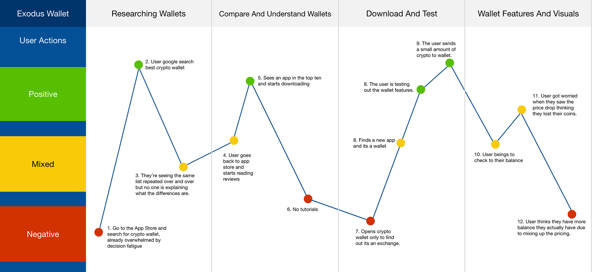
With the problem that needed to be solved already made clear, I reached out directly to people in my circle who are current exodus users. Asking them to explain their experience with the wallet and any pain points they may have felt relating to the clarity of price of the coin and their current holding balance.
The following are some of the issues that interviewees brought up:
1. Seeing the change difference at glance on the home page of the wallet.
2. The need see more coins/tokens simultaneously versus only seeing three coins per scroll.
3. The option to reorder their favourite coins.
4. Existing features on the app that aren't immediately obvious, such as the ability to swipe on the coin to allow you to send and receive transactions.
Comparative Analysis of Competitors
1. Ledger Live:
People enjoy using the Ledger Live app for its clean ui and customizable features which make users feel empowered. The ledger live app often reminds people of Coinbase's ui designs but has less user adoption due its overwhelming process.
2. Coinbase:
Coinbase clean ui brings a user friend experience but is very limited on what you can do, the app features vary depending where you globally which is often seen as intentional. Coinbase basic approach to crypto has users feel its less of a tech and more of a stocks app
3. Trust Wallet:
The wallet does not show a portfolio, similar to Exodus. It has a more low-tech, simple design that shows the total coins you hold and the price. Your overall wallet balance is shown at the top of the screen but only when selecting a coin can you see your holdings.
Ideation
Proto-Personas
Crypto Newcomer
They are a recent graduate from college or university and just got hired in their entry level career job. They are passionate about their career and want to progress forward, they do not have time to constantly be update to in the crypto space and understand all the new emerging tech. They heard about crypto from a trusted family member and only buys BTC, ETH and DOGE. Their main place to purchase crypto is through coinbase.
Frustations:
1. Crypto is overwhelming with the constant price changes.
2. Lack of saving opportunities for their generation.
3. Lack of understanding about the crypto space.
Crypto Aficionado
They are someone who has been involved in crypto for a few years now, they were there for a bear and bull market. They're always updated on the new protocols and development updates for their fav coins and isn't afraid to explain new ones the community has brought forward. Like many he started buying BTC, BCH, LTC and ETH moving deeper other projects like EOS and ATOM. He is someone who willing to try new wallets and applications if he deemed them trustworthy from community feedback.
Frustations:
1. Can never find a wallet that will both allow them to gain APY on their many, including alt coin, holdings.
2. They finds apps like coinbase go against their values as a crypto holder due its fee structure.
3. They don't understand where the crypto and banking relationship will start and end.
Design Principles
The goal of the redesign was to improve the user interface without drastically altering an already successful and well-known platform. The following is the guiding principles:
1. Creating a clear separation between Price and Balance
2. Improving user experience by removing frustrations in user journey and adding delightful micro-interactions.
3.. Making the search and discover of know crypto assets and wallet features, clear, concise and enjoyable.
Sketches:
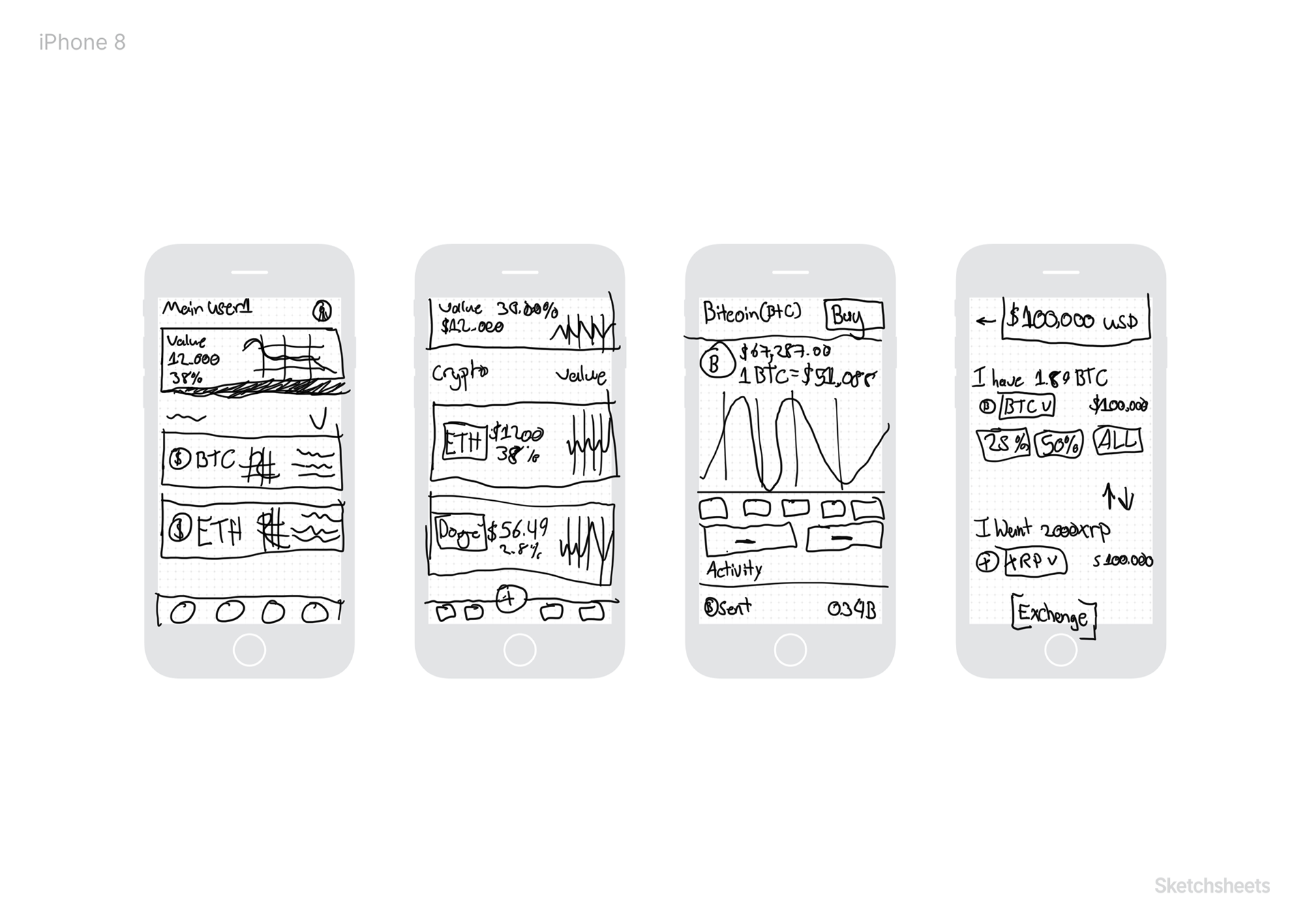
Wireframes
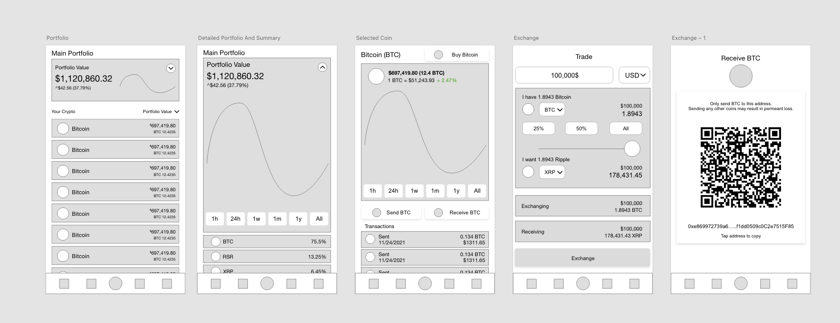
Made in XD
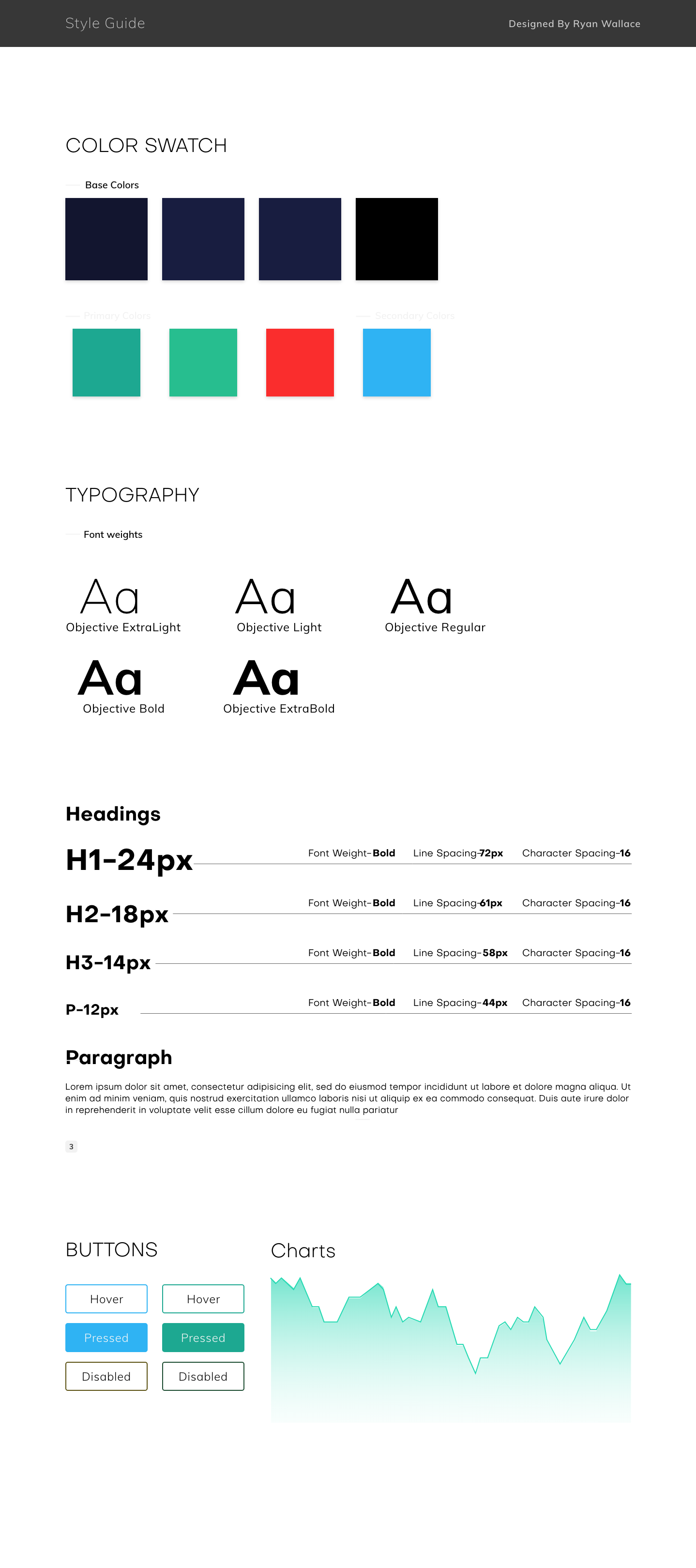
Style Guide
Implementation
Main Screen
Summary
Select Coin
Exchange
Key changes and Rationale
- The main screen and summary screen have been updated to give the user a sense of control and freedom of movement. The design allows the user to see more information without overwhelming them.
The main screen changes give better information on how the overall portfolio is doing without losing information. If the user wishes to press the profile they can see a detailed list of the percentage of their holdings.
After talking to my focus group, the confirmed Exodus had a lot of great features on the mobile app that they did not know existed. This means the app is either being under-utilized or over designed.
My goal for the main screen was to bring in simplicity without alienating our current users by removing features they find valuable.
- The selected coin screen has be the most interesting aspect of the redesign because the focus group provided wildly varying feedback and feelings towards the existing designs.
I wanted to keep the users holdings at the very top of the screen to give them a sense of familiarity with where can they find their holdings while everything else is secondary information. The goal was to bring the design to a place where the price and balance share respect to one another but also allow our users to understand what is happening on the screen at all times. i
The exchange and receive screens give the user the ability to exchange currencies between one another while using a currency they are familiar with.
To find a balance with price and balance amount, I had to take into considered the layout of the screens and ask questions on what is most important to our users and how they going to approach an exchange. I decided to allow the user to change the currency type while exchange between coins.
From my research and personal experience, the USD price is always top of mind. Many users don't think about exchange 7 ETH for 7 BTC and wonder why it is not working.
Conclusion
Exodus is an amazing product with users who trust and use the product everyday. Working on this project got me thinking a lot about how to design for crypto users at a variety of different experience levels and I strongly believe I achieved the goal of this project, finding a good balance between total holdings and current price of the coin.