
Key Data Points:
80% Quiz Completion Rate: Increased from 45% to 80% after redesign.
43% Boost in Completion Rate: Significantly enhanced user engagement.
1.2% Global Impact on Conversion Rate: Raised CVR from 16% to 19%.
$12 Million Additional Revenue: Generated through improved departmental spending.
51% Reduction in Transition Screens: Streamlined the quiz by eliminating unnecessary content.
Introduction
WeightWatchers pivoted from a 65-year legacy of in-person interactions to embrace a digital-first model. As a Senior Product Designer specializing in growth, I was tasked with overhauling the recommendation quiz funnel. This quiz is pivotal in guiding users to the right product and showcasing the benefits of our premium membership tier. My objective was to enhance user engagement, boost completion rates, and clearly communicate WW's value proposition.
Challenges Faced
The existing quiz presented several hurdles:
Low Completion Rate: Only 45% of users completed the quiz, leading to a significant drop-off.
User Disengagement: 55% of visitors abandoned the quiz, indicating a disconnect.
Generic Feedback: Users felt the results didn't reflect their individual needs.
Excessive Transitions: Transition slides made up 51% of the quiz, causing frustration.
Privacy Concerns: Users were hesitant to provide personal information upfront.
Crafting the Solution
To tackle these challenges, I focused on data-driven design improvements:
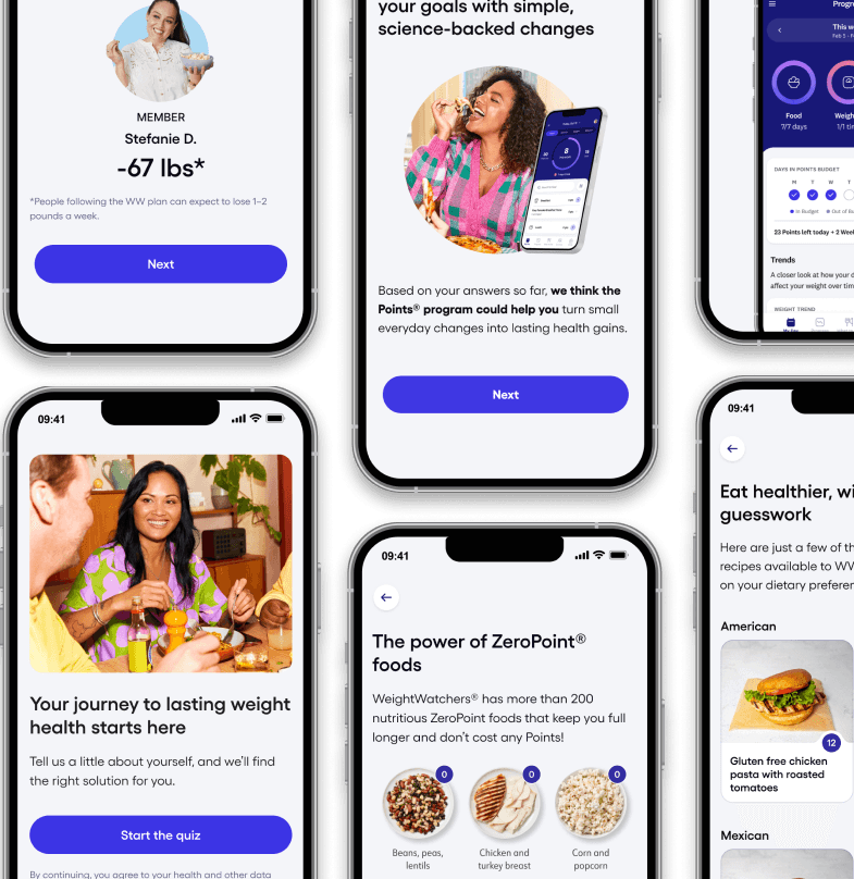
Enhancing Assessment Questions
Simplified Progress Indicators: Made the number of questions and progress clear to users.
Multiple Answer Options: Allowed users to select multiple reasons for wanting to lose weight, capturing more accurate responses.
Added Relevant Questions: Included inquiries about dietary restrictions and medical conditions for better personalization.

Streamlining Transition Screens
Reduced Excessive Transitions: Cut down unnecessary slides by 51% to make the quiz more concise.
Improved Visual Design: Introduced engaging visuals and minimized text-heavy content.
Focused on User Needs: Shifted emphasis from program features to addressing user challenges.

Personalizing the Results Page
Detailed Feedback: Provided results that reflected individual answers, enhancing relevance.
Membership Comparison: Offered a side-by-side view of different plans for informed decision-making.
Transparent Value Proposition: Clearly articulated how WW addresses specific user goals.

Results for WeightWatchers and Its Users
The redesign led to remarkable outcomes:
Increased Completion Rate to 80%: A 43% uplift, indicating higher user engagement.
Higher Conversion Rate: Global CVR rose from 16% to 19%, a 1.2% improvement.
Enhanced User Satisfaction: Users received personalized recommendations that resonated with their needs.
Financial Impact
Our efforts translated into significant monetary gains:
$12 Million in Additional Revenue: The improved quiz funnel boosted departmental spending.
Increased Premium Memberships: Clear communication of value led to more users opting for premium tiers.
Takeaways and Growth as a Designer
This project reinforced several key lessons:
User-Centric Design is Crucial: Understanding and addressing user needs drives engagement.
Data-Driven Decisions Pay Off: Leveraging research leads to impactful solutions.
Simplicity Enhances Experience: Streamlining processes reduces drop-offs and improves satisfaction.
Conclusion
Redesigning the WW recommendation quiz was a transformative experience. By focusing on personalization and user needs, I was able to significantly improve engagement and drive substantial revenue growth for the company.


