
Summary of Key Data Points
23% increase in conversion rates after Pricing Page Redesign (Test 1).
23% improvement in customer lifetime value (LTV) resulting from Test 1.
$20 million projected revenue increase due to successful implementation.
Over 5 minutes average time spent on the pricing page before redesign.
70% of new subscriptions are from returning members valuing in-person workshops.
No significant lift in conversion from Simplified Pricing Display (Test 2); test deemed inconclusive.
6 months duration over which the two major tests were conducted.
3 membership plans originally presented, contributing to cognitive overload.
Highest click-through rate (CTR) observed for the Digital 6-month plan.
Five most common offer structures analyzed to understand pricing complexities.
Introduction
When I joined WW's Growth team, I was assigned with a critical mission: increase customer conversion. My goal was to find innovative ways to optimize the purchase funnel, not only to attract new and returning customers but also to convert them at a higher rate. This involved reimagining the user experience on both mobile and web platforms to make the journey from prospect to subscriber as seamless as possible.
Challenges
Understanding User Behavior
Prospective customers were spending an average of over five minutes on the pricing page—a significant amount of time—yet conversion rates remained low. This indicated that while users were interested, they were experiencing obstacles that prevented them from completing the signup process.
Cognitive Load and Decision Fatigue
The existing purchase funnel was causing cognitive overload and decision fatigue. With plan types, plan lengths, and pricing spread across separate pages, users found it difficult to compare options, especially on mobile devices where constant scrolling was necessary. This complexity led to confusion and hesitation, resulting in lost conversions.
Inconsistent Pricing Information
WW offers various discounts and promotions throughout the year, leading to frequent updates on the pricing page. This resulted in inconsistent pricing displays, further confusing prospective customers and disrupting their user experience.
Context
WW is a science-backed solution for weight management, traditionally focused on in-person coaching and workshops. However, due to COVID-19 limiting in-person sessions, the company pivoted towards digital memberships.
Solution
As a Senior Product Designer specializing in growth, I collaborated closely with Pricing Promotion, Product, Marketing, Engineering and Content teams to optimize the conversion funnel through hypothesis-driven A/B and multivariate testing. Over many months, I led two major tests aimed at addressing the identified challenges:
Test 1: Pricing Page Redesign
Problem: Cognitive Load and Decision Fatigue
Most prospects landed on the pricing page, where they were presented with three membership plans and had to choose their plan length on a subsequent page. This setup was overwhelming and caused users to spend excessive time making a decision. On mobile devices, this issue was exacerbated due to limited screen real estate, making it difficult to compare options without constant scrolling.

Hypothesis
By reducing the number of steps and guiding customers towards the Digital 6-month plan as the default membership, we believed we could lower bounce rates and increase conversion. The Digital plan had the highest click-through rate, and focusing on it made sense, especially during the pandemic when in-person workshops were less accessible.
What We Tested
Streamlined Options: Reduced the plan choices to focus on the Digital 6-month plan as the default membership. This eliminated unnecessary options that were causing decision paralysis.
Combined Pages: Merged the separate pages for plan types, plan lengths, and pricing into a single, cohesive pricing page. This consolidation reduced the steps needed to complete a purchase, simplifying the user journey.
Simplified UI: Designed a cleaner interface that made it easier for users to compare options without excessive scrolling. Key information was presented upfront, and visual elements were used to highlight the most popular choice.
Making Trade-Offs
During internal testing, we identified two critical issues that needed to be addressed before launching:
Promotion Codes
Promotion codes were previously entered on the plan-length page. Moving them to the checkout flow required coordination with other teams and would delay the launch. As a workaround, we added a link on the new pricing page that, when clicked, revealed an input field for promotion codes. This ensured users could still apply discounts without complicating the design.
Discoverability of Other Membership Options
While focusing on the Digital plan, we didn't want to alienate returning members who valued in-person workshops. We made the option to change membership types more intuitive by adding clear navigation elements and labels. This allowed users interested in other plans to easily find and select them.
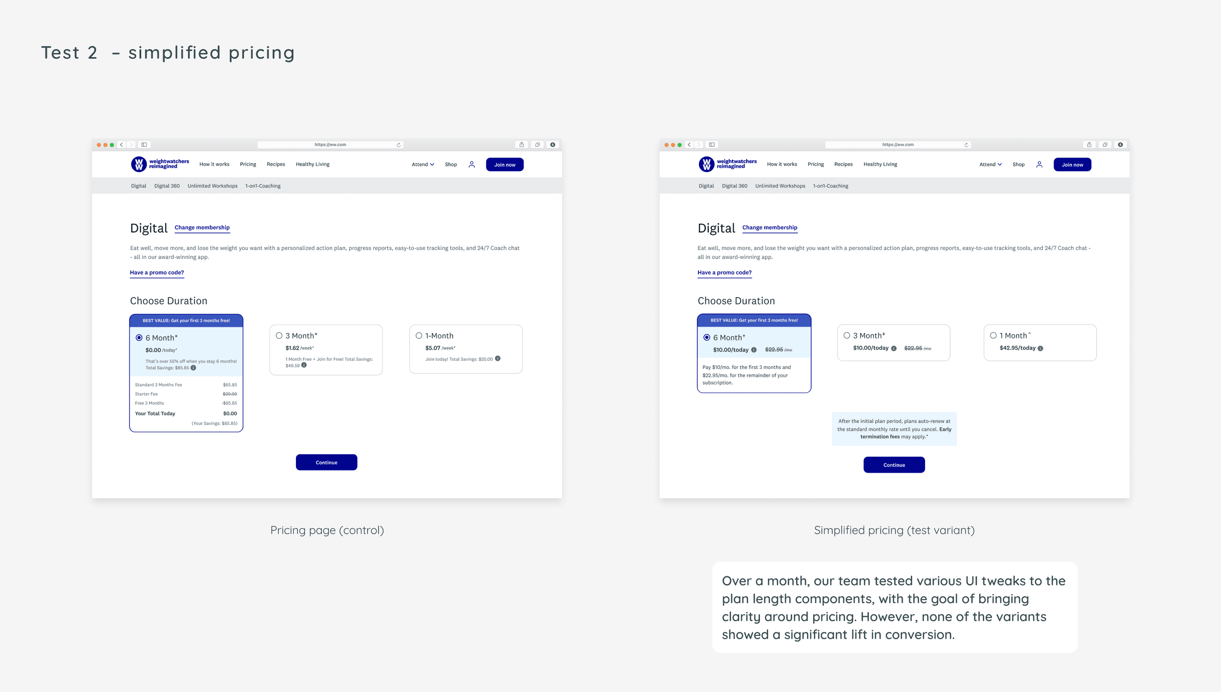
Test 2: Simplified Pricing Display
Problem: Lack of Clarity on Pricing and Offers
Frequent promotions and discounts led to a complex pricing structure that confused users. Through user interviews, we learned that prospects were often uncertain about the actual cost, how much they were saving, and what they were committing to financially. Cancellation due to misunderstanding of pricing and offer terms was one of the top reasons for member churn.
Insights from User Interviews
Users felt that pricing information was inconsistent and scattered.
Fine print and detailed breakdowns were causing more confusion than clarity.
Prospects wanted a straightforward understanding of what they were paying now versus later.
Hypothesis
By simplifying the price breakdown and visually highlighting savings, we believed we could reduce bounce rates from the pricing page and increase conversion. Clear and consistent pricing information would help set accurate expectations and build trust with prospective customers.
What We Tested
Consistent Pricing Display: Standardized how prices and savings were shown across all plan lengths. We eliminated complex calculations and presented total costs upfront.
Visual Highlights: Used visual cues like badges, color coding, and simplified graphics to draw attention to savings and promotions.
Simplified Fine Print: Replaced dense fine print with concise, easy-to-understand terms. Important information was pulled out and displayed prominently.
Design Exploration and Stakeholder Alignment
I conducted a deep dive into the five most common offer structures to understand the math behind each plan, including total cost, duration, savings, and payment schedules. This analysis helped prioritize the critical information users needed.
I then created a range of design options:
Minor UI Tweaks: Adjustments to font sizes, colors, and spacing to improve readability.
New Pricing Frameworks: Concepts like monthly versus yearly payments to reduce decision fatigue.
Enhanced Visual Aids: Graphs or progress bars showing savings over time.
I presented these options to stakeholders, and we aligned on the following goals:
Short-Term Goal: Simplify the pricing display to reduce friction in the decision-making process.
Long-Term Goal: Develop tailored signup experiences for new and returning members to enhance overall storytelling and engagement.
Test 1: Pricing Page Redesign
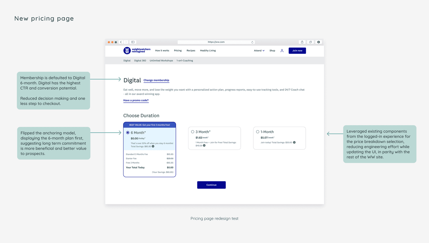
The redesigned pricing page led to a 23% increase in conversion rates and a 23% improvement in customer lifetime value (LTV). This significant uplift accelerated subscriber acquisition during the busy diet season, contributing to a projected revenue increase of $20 million. Following the successful test in the U.S., the new pricing page was implemented globally and became the most effective strategy for increasing conversion in 2021.
Test 2: Simplified Pricing Display

The multivariate tests for the simplified pricing display did not yield a significant lift in conversion and were determined to be inconclusive. While users appreciated the cleaner design, the changes were not enough to overcome the underlying confusion about WW's value proposition and how the program worked.
Insights from the Results
The simplified pricing display alone was insufficient to address deeper user concerns.
Users needed more comprehensive information about the program's efficacy and benefits.
Trust and transparency remained critical factors influencing conversion.
Impact
Test 1 Impact
By simplifying the purchase funnel and reducing cognitive load, we enhanced the user experience and made it easier for customers to make purchasing decisions. The success of Test 1 not only boosted conversion rates but also improved customer satisfaction by providing clearer pricing information and reducing confusion.
Test 2 Impact
Although Test 2 did not yield immediate results, it provided valuable insights into user behavior and highlighted the need for a more holistic approach to address user concerns. It underscored the importance of aligning pricing strategies with clear communication about product value.
Next Steps
Conduct Additional Research
Partnered with our UX Researcher to conduct in-depth user interviews aimed at understanding the prospect's buying journey. We wanted to identify:
Usability issues causing confusion or hesitation.
Misalignments between user expectations and the information presented.
Unanswered questions or concerns that were barriers to conversion.
We distilled these pain points and developed a framework to prioritize future testing ideas, ensuring that we focused on areas with the highest potential impact.
Iterate and Test New Hypotheses
Recognized that addressing pricing clarity required more than UI changes. We planned to:
Enhance Educational Content: Provide more information about how WW works and its benefits.
Personalize the Experience: Tailor the signup journey for different user segments, such as new versus returning members.
Improve Trust Signals: Include testimonials, success stories, and evidence of efficacy to build confidence.
Collaborate with Cross-Functional Teams
Worked closely with Marketing, Content, and Product teams to ensure consistent messaging across all touchpoints. This collaborative approach aimed to create a cohesive and persuasive user experience.
Takeaways
Embrace a Range of Ideas
In growth design, exploring a wide landscape of possibilities is crucial. Being open to experimenting with different concepts, even those that seem unconventional, can lead to significant breakthroughs. Don't be afraid to give it a go and learn—embrace failure as a stepping stone to success.
Iterative Testing is Key
A single test may not prove or disprove a hypothesis. Continuous testing and data analysis are essential to understand underlying issues and refine solutions accordingly. Inconclusive results aren't failures; they're opportunities to dig deeper and uncover the root causes.
User-Centric Design is Essential
Understanding user needs, expectations, and pain points is vital. Solutions should be grounded in user research to ensure they address the real issues affecting conversion.
Cross-Functional Collaboration Enhances Success
Working closely with other teams enriches the design process and ensures that all aspects of the user experience are aligned and optimized for growth.
Conclusion
This project reinforced the importance of user-centric design and data-driven decision-making in driving business growth. By addressing user pain points and simplifying the purchase process, we achieved substantial improvements in conversion rates and revenue. The experience has made me a more effective and insightful designer, reinforcing the value of continuous learning and adaptation in the ever-evolving field of growth design.

