Increased items tracked by 10%, with members logging food on 4+ days per week.
Reduced average tracking session time from 1 minute 20 seconds to 33 seconds.
Cut customer support inquiries by 51%, decreasing food tracking tickets from ~400 to ~200 weekly.
Boosted weekly engagement from 30% to 50%, enhancing user retention.
Significantly lowered membership cancellation rates.
I noticed that our members were struggling with one of the app's core features: food tracking. Logging meals should be a seamless part of their wellness journey, but instead, it was a source of frustration. My mission was clear—streamline the food tracking experience to eliminate friction and reduce the time it takes for members to track what they eat.
The Challenge: A Complex and Unintuitive Experience 😖
Members were overwhelmed by a convoluted tracking flow that lacked clarity and efficiency. Here's what I discovered:
No Clear Sense of Place: Users were confused about which meal time and date they were logging, leading to disorientation.
Confusing User Flow: The process required too many steps, with inconsistent navigation that left users lost.
Redundant Data Entry: Members had to repeatedly input meal times, dates, and portions—even when tracking multiple items for the same meal.
This complexity was more than an inconvenience; it was causing users to skip logging altogether and even cancel their memberships.
The Goal: Simplify and Enhance Food Tracking 🎯
I set out to make tracking food easier and more effective by focusing on three key objectives:
Increase Tracking Frequency: Encourage members to log their meals more often.
Decrease Time Spent on Tracking: Reduce the time required to complete the tracking process.
Enhance Overall Effectiveness: Create a more efficient and impactful user experience.
The Research: Understanding Member Behavior 🔍
Digging into user data and behaviors, I uncovered valuable insights:
87% of searches were intent on tracking specific items, not exploring.
Over 70% of food items had been tracked before, indicating repeat behavior.
65% of members logged their meals "just in time," typically tracking all items for one meal in a single session.
These findings highlighted the need for a faster, more intuitive tracking system that caters to habitual patterns.
Crafting the Solution: A Seamless and Structured Flow 💡
Collaborating with product partners, I aimed to design an intuitive navigation system that:
Reduces Steps: Simplifies the tracking process by eliminating unnecessary actions.
Provides Clarity: Offers a clear path forward, so members always know where they are in the process.
Enhances Progress Tracking: Gives users a better sense of their tracking habits and goals.
Design Principles Guiding the Way 🧭
To keep the project focused, I adhered to three main principles:
Action-Oriented: Avoid distractions by keeping the interface clean and focused on essential tasks.
Easy-to-Use: Minimize taps and inputs to save users time.
Easy-to-Follow: Ensure navigation is intuitive with real-time feedback.
Bringing Ideas to Life: From Sketches to Wireframes 🎨
Creating User Journeys: Using Figjam, the team and I brainstormed and mapped out various user flows, selecting the best elements that aligned with our objectives.
Ideation: We iterated on concepts, incorporating feedback from leadership and revisiting user research to refine our ideas.
Wireframing: Moving into low-fidelity designs, we collaborated closely with engineering to address technical considerations and ensure feasibility.

The Final Design: Streamlined and User-Friendly 🖼️
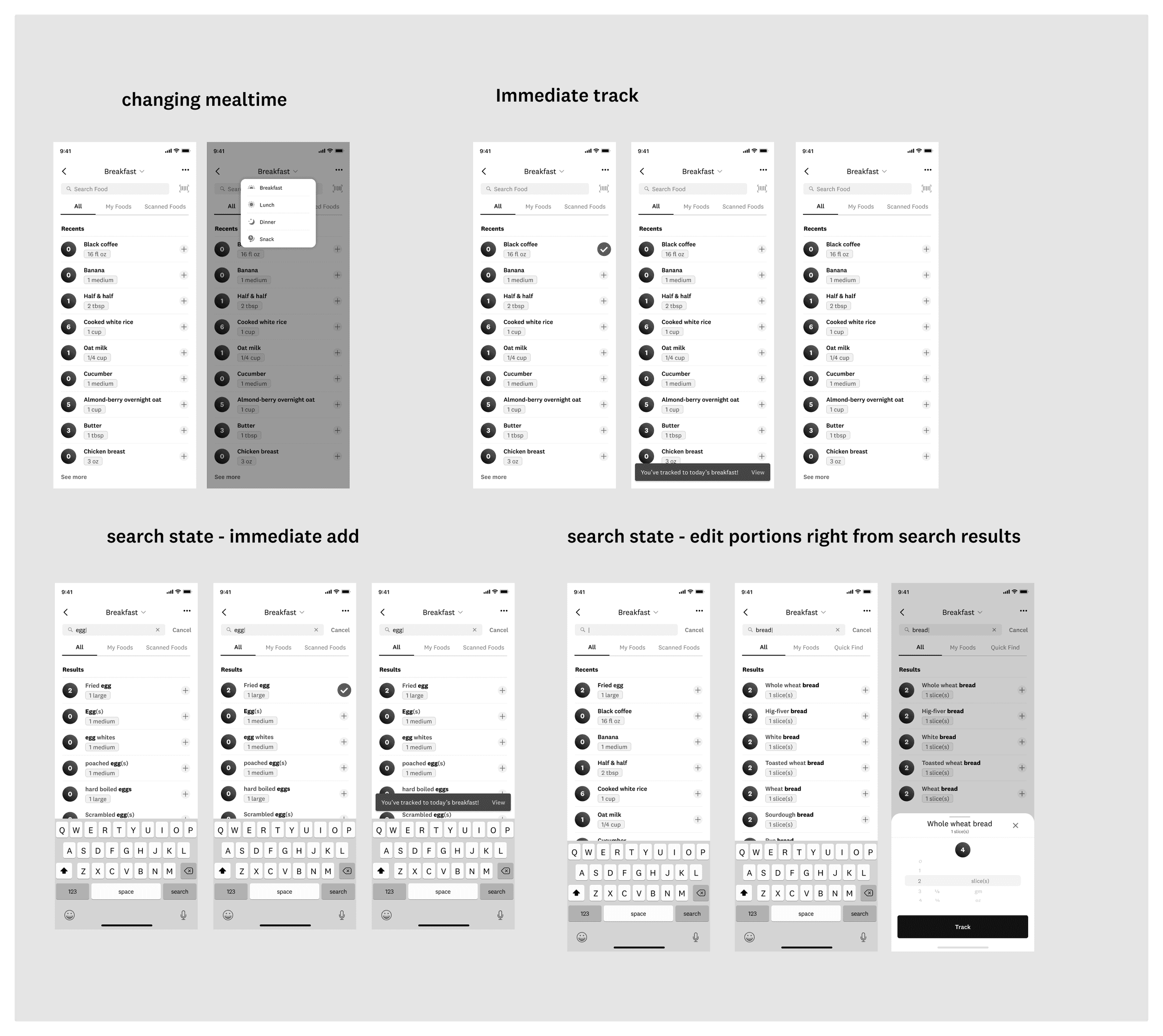
Simplified Tracking: We reduced the number of screens and eliminated mandatory steps unrelated to core tracking. One-tap tracking became a game-changer, allowing for effortless logging. Real-time confirmations provided immediate feedback.
Seamless Tracking Loop: After logging a meal, members were directed back to their specific meal time, making it easier to add or edit entries. The "save as meals" feature was relocated to enhance future tracking of favorite meals.
Reduced Noise: Consistency was key. We streamlined navigation across all entry points, consolidated advanced features, and removed low-usage functions. Adhering to standard interaction patterns for search functionality improved overall efficiency.

The Impact: Delivering Results for Members and the Business 📈
Positive Member Feedback: The new flow was praised as impactful, simple, fast, lightweight, clean, and intuitive.
Increased Tracking Frequency: Items tracked increased by 10%, and members began logging food on 4+ days per week within the first few weeks.
Reduced Tracking Time: Average session durations dropped to 33 seconds from the previous 1 minute 20 seconds.
Lowered Support Inquiries: Customer support tickets related to food tracking decreased by 51%, from ~400 to ~200 weekly.
Enhanced Feature Usage: There was a surge in the use of advanced features like food creation, recipe tracking, and nutritional insights.
Boosted Engagement and Retention: Weekly engagement rose from 30% to 50%, leading to improved retention and a significant drop in cancellation rates.
Takeaways: Growing as a Designer 🌱
This project reinforced the importance of user-centered design and data-driven decision-making. By focusing on the actual behaviors and needs of our members, I was able to create a solution that not only enhanced their experience but also delivered measurable business value. It taught me that simplicity and clarity are powerful tools in driving user engagement and satisfaction.
TV Spotlight


