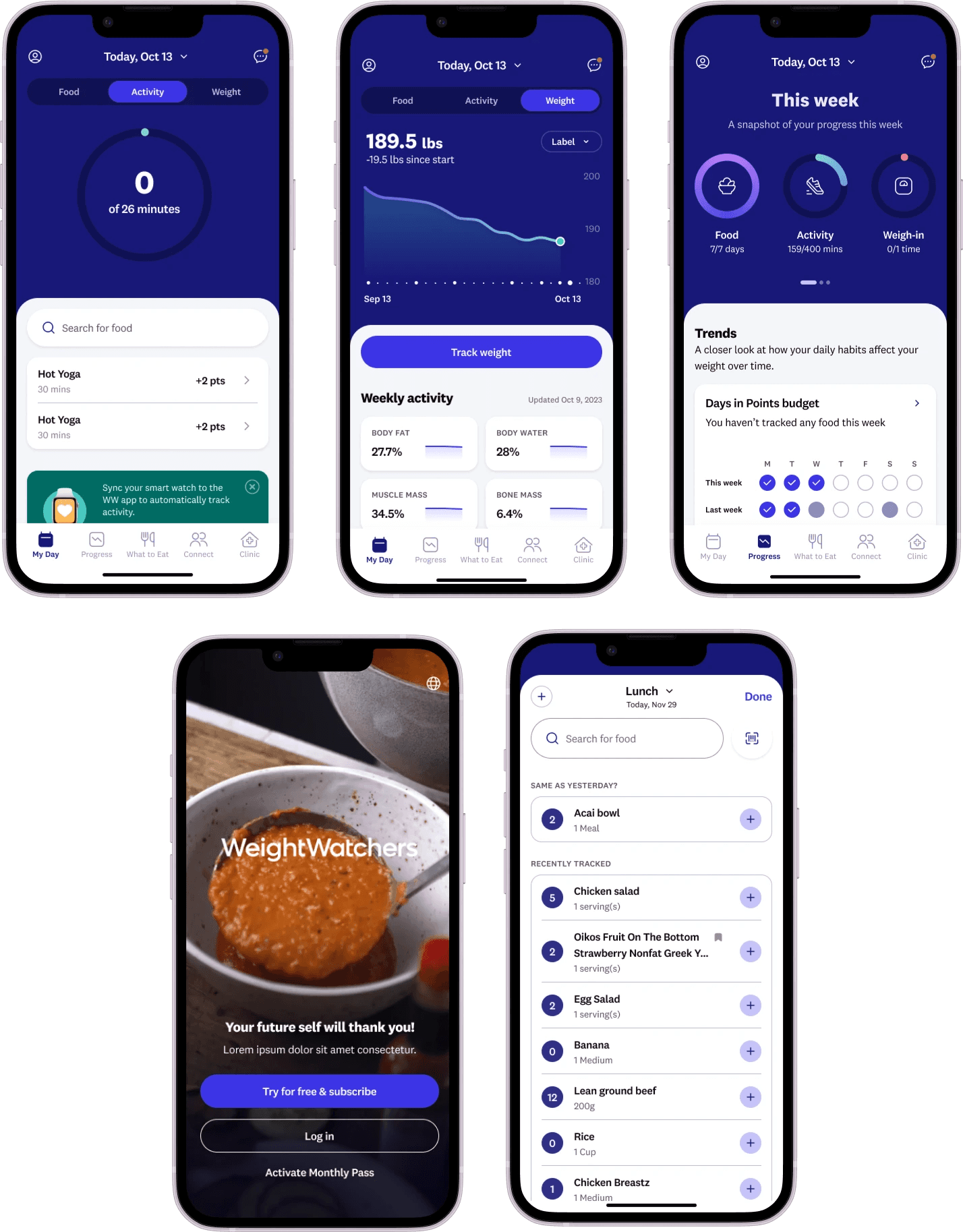
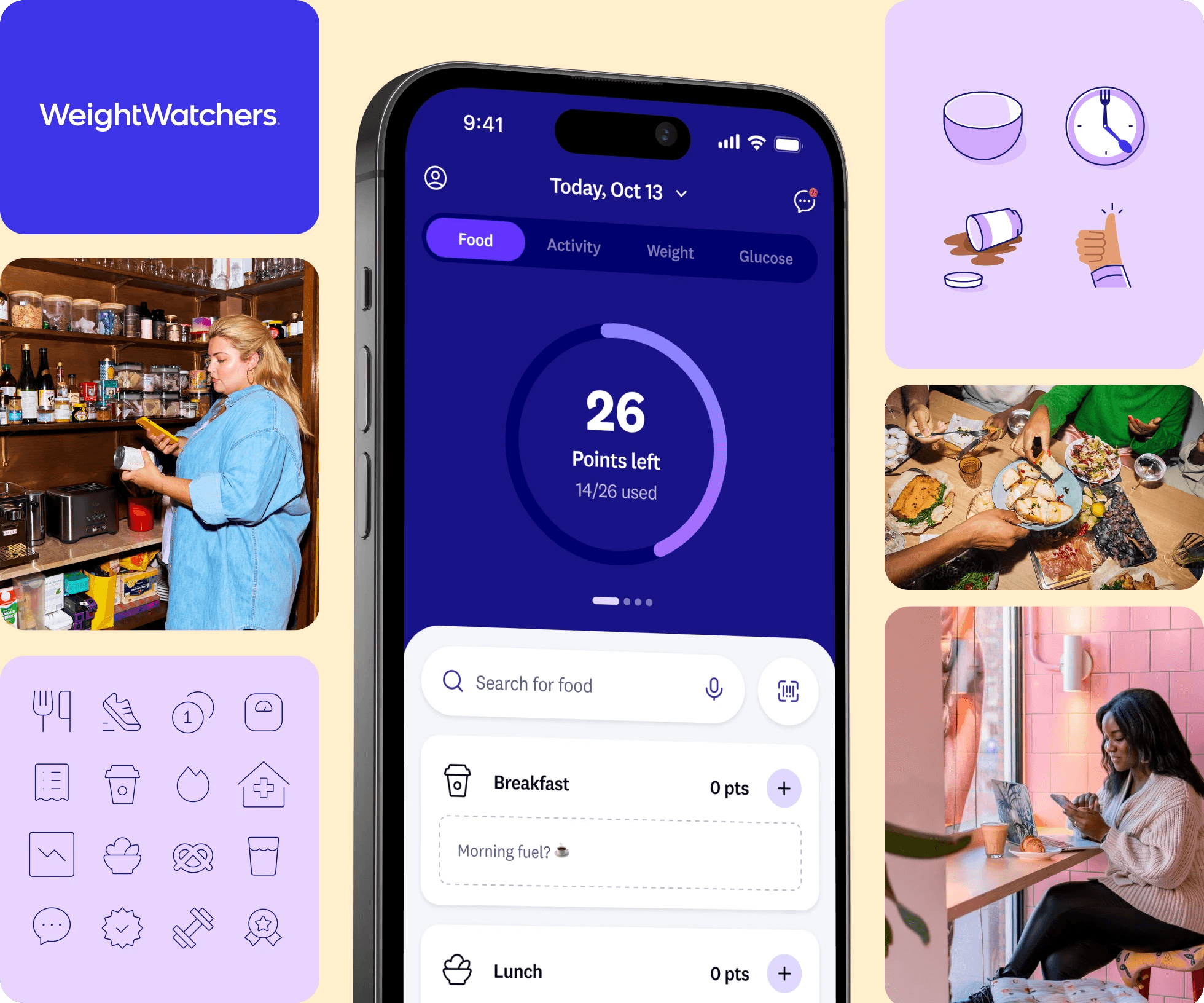
Launched the WW Balance Design System globally in February 2024
Completed the redesign project in six months
Increased activation rates by 2%
Boosted food tracking by 3%
Improved login rates by 1.5%
Enhanced user engagement and satisfaction
Streamlined collaboration across design, product, and engineering teams
Received overwhelmingly positive user feedback
Conducted extensive user testing and stress testing across devices
WW Balance Design System Implementation
In 2013, the WeightWatchers (WW) app began as a simple companion to in-person workshops, primarily helping members track their food intake and points. Over time, it evolved into the central hub of our program. This rapid evolution led to a flood of new features added without cohesive design or architectural planning, resulting in an overwhelming and confusing user experience.
The Challenge
Weight loss is inherently challenging and often discouraging. Our app was supposed to be a source of joy and support, but instead, it was adding to our members' frustrations due to:
Overwhelming Complexity: The quick addition of new features without a strategic design plan made the app cluttered and difficult to navigate.
Inconsistent User Experience: The lack of a unified design strategy led to inconsistencies in the app's interface, causing confusion among users.
Inefficient Development Processes: Designers and engineers were repeatedly creating similar components, leading to inefficiencies and further inconsistencies.
Scope and Constraints
This was a significant project that required extensive collaboration among design, product, and engineering teams. Managing numerous moving parts while ensuring consistent communication and setting clear expectations across the organization were key challenges we faced. Coordinating efforts across different departments was crucial to the project's success.
Crafting the Solution
Project Kickoff and Timeline
We devoted six months to the redesign, culminating in the release of the updated app in February 2024. This period was intensive, requiring meticulous planning and execution. The launch was the culmination of our efforts and was met with great feedback from users. Not only did the new design enhance user experience, but it also expedited our design and development procedures, enabling quicker releases of updates in the future.
Collaborating for a Modernized Interface
In close collaboration with the marketing and brand teams, we conceptualized a modernized interface and aesthetic for the app. This process involved brainstorming sessions, mood boards, and multiple design iterations. Our objective was to harmonize the app's functional and visual elements with the latest branding and advertising initiatives. After considering several design options, we chose a direction that struck a balance between usability and aesthetics.
Component Creation: "Blurplifying"
To address inefficiencies and inconsistencies, we spearheaded the development of the WW Balance Design System, a process we affectionately called "blurplifying." The design team split up the work to develop reusable components and implement the new design. We focused on creating adaptable UI elements with multiple variants to ensure consistency across the app. This method required meticulous attention to detail and collaboration to standardize component usage and preserve design integrity.
Rigorous Examination
We conducted extensive user testing at every stage of the design and development process. Gathering feedback on the revamped user interface and overall experience was crucial to ensuring the changes were effective and well-received. Anticipating potential user concerns, we proactively informed users about upcoming changes and provided support resources to ease the transition.
Once the design system was finalized, we worked closely with the engineering team to build and integrate the new components. This phase involved rigorous internal and stress testing to validate the performance and functionality of each component. Ensuring that all elements operated seamlessly across various devices and scenarios was a critical aspect of this stage.
The Results
The WW Balance Design System launched globally in February 2024, and the impact was immediate:
Activation Rates Increased by 2%: More users completed the onboarding process smoothly.
Food Tracking Boosted by 3%: Users found it easier to consistently log their meals.
Login Rates Improved by 1.5%: Enhanced user experience encouraged more frequent engagement.
These improvements reflect a more engaging and convenient experience for our members. Feedback from our users has been overwhelmingly positive. One member remarked:
"The new app is gorgeous. I adore the way everything looks and flows so well. They've really stepped up their game at WW!"

Business Impact
These enhancements didn't just make our users happier—they also had a significant business impact:
Increased User Retention: A smoother app experience reduced churn rates.
Higher Revenue: Improved engagement led to increased subscription renewals and upsells.
Operational Efficiency: Streamlined development processes saved time and resources on future updates.
Personal Takeaways
This project was a pivotal moment in my career, demonstrating the significant influence a well-executed design system can have on operational efficiency and user experience. While I had previously understood the benefits of design systems in theory, working on this large-scale implementation provided practical insights into their utility.
Collaboration is Crucial: Managing cross-functional teams and ensuring clear communication were essential to the project's success. The experience highlighted the importance of strong communication and cross-functional collaboration in successfully managing complex projects.
Consistency Enhances Engagement: A unified design not only looks better but also builds user trust and encourages interaction. Our ability to quickly develop and implement reliable, high-quality user experiences was greatly improved by the design system, allowing us to better meet customer and market demands.
Efficiency Enables Innovation: Standardizing components freed up time and resources, enabling the team to focus on innovative features. The new design system expedited our design and development procedures, allowing for quicker release of updates in the future.
User-Centric Testing is Vital: Continuous user feedback and rigorous testing ensure that design changes truly meet user needs.
The WW Balance Design System's accomplishments are a credit to the commitment and cooperation of all involved and provide a template for similar projects in the future. By transforming the WW app into a user-friendly platform, we not only supported our members' weight loss journeys but also drove tangible growth for the company. This experience deepened my understanding of the strategic role design plays in solving complex business challenges and making a real-world impact.


