Summary:
Massive User Engagement: Within the first 48 hours, the revamped website received nearly 1 million visits and 30,000 downloads.
National Awareness: 74% of Canadians are aware of the new version, according to Dalhousie University.
Government's Most Visited Site: Became the most visited site of the Government of Canada.
Accessibility Compliance: Achieved WCAG 2.0 AA compliance and provided content in both English and French.
Cross-Department Training: Trained multiple departments to utilize new digital tools and dashboards.

Revitalizing Canada’s Food Guide for the Digital Era
Introduction
I had the privilege of contributing to the digital rebirth of Canada’s most iconic health and wellness resource: Canada’s Food Guide. Originally created in 1942, it's hailed as one of the most-read public documents, serving as a foundational source of nutrition information for Canadians and health professionals worldwide.
Challenges We Faced
Our mission was ambitious: transform a longstanding national resource into a modern, interactive platform accessible to all Canadians. Key challenges included:
Outdated Interface: The existing platform lacked responsive design, making it unsuitable for today's web and mobile users.
Interactivity Demand: Users expected engaging, interactive elements that the old guide didn't offer.
Content Management Complexity: Needed customized plugins for content control to handle frequent updates efficiently.
User-Friendly Architecture: Required a redesign of the information architecture for intuitive navigation.
Accessibility Standards: Had to meet WCAG 2.0 AA compliance and be fully bilingual to serve all Canadians.
Public API Requirement: Needed a publicly available RESTful API for data interaction across multiple platforms.
The Solution I Developed
As the User Experience Designer, I took a user-centric approach to tackle these challenges:
User Testing and Feedback: Conducted nationwide user interviews using usertesting.com to gather insights and ensure compliance with government guidelines.
Focus Groups: Organized sessions with diverse user groups to understand their needs and pain points.
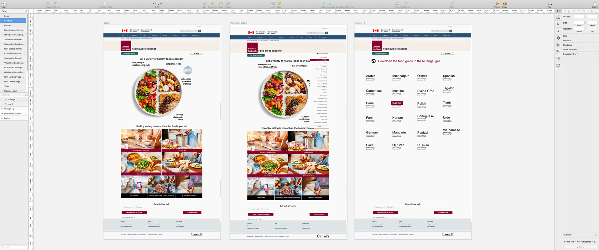
Interface Redesign: Leveraged feedback to revamp the UI using Sketch, focusing on responsiveness and visual appeal.
Interactive Features: Integrated interactive elements and customized CMS plugins for better content control.
Accessibility and Bilingual Support: Ensured the platform was accessible to all users by meeting WCAG 2.0 AA standards and providing content in both English and French.
API Development: Implemented a RESTful API to allow seamless data interaction across various platforms.
We also trained multiple government departments to use the new dashboard and digital tools, facilitating smoother content creation and updates.
Results That Helped the Project and Its Users
The impact of our work was immediate and significant:
Unprecedented Engagement: In the first 48 hours, the site attracted nearly 1 million visits and 30,000 downloads.
Widespread Awareness: 74% of Canadians became aware of the new Food Guide shortly after launch.
Top Government Site: It became the most visited site under the Government of Canada.
Enhanced Accessibility: Provided an inclusive platform accessible to a diverse cross-section of Canadians.
Successful Launch: Culminated in a nationally televised event hosted by the Minister of Health, highlighting the project's importance.

Impact on Broader Objectives
While not a commercial venture, the project's success had far-reaching effects:
Public Trust and Engagement: Strengthened the government's reputation for providing valuable, accessible resources.
Educational Advancement: Offered a modern educational tool that health professionals and the public could rely on.
International Recognition: Positioned Canada as a leader in digital health and wellness education.
Takeaways That Made Me a Better Designer
User-Centered Design is Paramount: Direct user feedback is essential for creating solutions that truly meet users' needs.
Accessibility Matters: Ensuring compliance with accessibility standards broadened the platform's reach and usability.
Collaboration is Key: Working with multiple departments underscored the value of cross-functional teamwork.
Adaptability Enhances Success: Navigating a multi-year project taught me to be flexible and responsive to changing requirements.
Data-Driven Decisions Lead to Impactful Results: Leveraging user data and analytics informed more effective design choices.
Conclusion
Being part of the team that revitalized Canada’s Food Guide was a rewarding experience. By focusing on user needs and modern design principles, we transformed a historical document into a dynamic, accessible digital platform that will serve Canadians for years to come.


