Summary:
Platform Modernization: Led the overhaul of a 20-year-old veterinary health product registration platform in Canada.
User Testing Conducted: Interviewed and gathered feedback from over 50 users across Canada.
Bilingual Support: Implemented in both English and French to meet official language requirements.
Awards Won: Platform received the Governor General's Award for Service Excellence and the Assistant Deputy Minister's Award for Innovation.
Mobile Accessibility: Introduced mobile support, increasing on-the-go access by 100% for border and inspection staff.

Overhauling Canada's Veterinary Health Products Platform for Modern Accessibility
Introduction
I was part of a team tasked with completely overhauling Canada's platform for registering Veterinary Health Products. Our client, responsible for managing the import and sale of these products nationwide, needed a modern web-based system to keep pace with industry demands. The goal was to create an accessible platform for international agencies and the public to register new drugs and substances in Canada.
Challenges We Faced
The existing platform was riddled with issues:
Outdated Framework: The system was built on a framework that was approximately 20 years old, lacking any agile processes.
Inefficient Workflows: Human workflows were convoluted, requiring extensive questioning before any system remapping could occur.
No Notification System: The absence of modern notification features hindered timely communication.
Lack of Mobile Support: The platform was inaccessible on mobile devices, making it nearly impossible for border and inspection staff to use on-the-go.
Public Reporting Gaps: There was no online portal for visitors or the general public to report issues with existing products.
Addressing these challenges would not only modernize the platform but also position Canada at the forefront of veterinary health product regulation.
The Solution I Developed
As the User Experience Designer, I took on the challenge of revamping the user interface and flows:
User Testing: Conducted interviews and gathered feedback from over 50 testers across Canada using usertesting.com to ensure compliance with government guidelines and standards.
Focus Groups: Organized focus groups to dive deeper into user pain points and expectations.
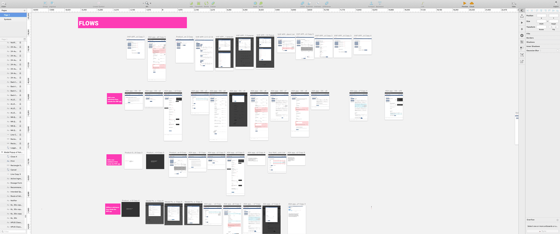
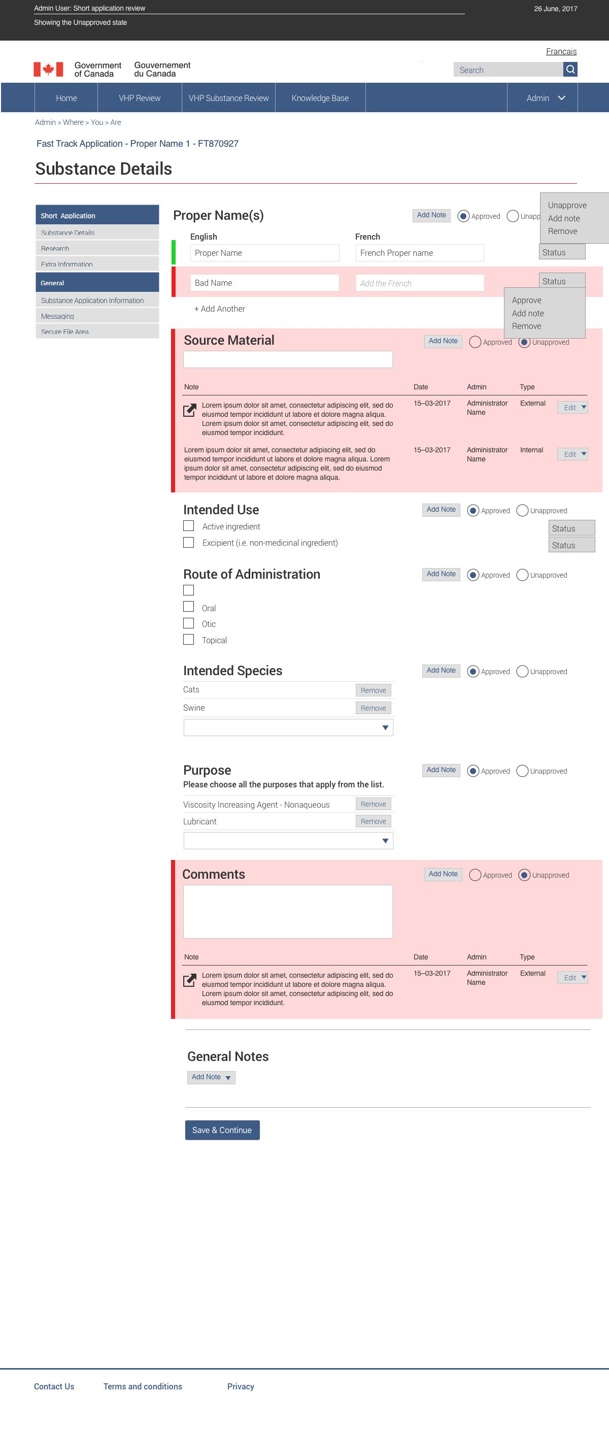
Interface Redesign: Leveraged insights to modify the UI using Sketch, enhancing usability and accessibility.
Bilingual Implementation: Ensured the platform served all pertinent information and operations in both English and French.
Mobile Optimization: Redesigned the platform to be fully responsive, enabling mobile access for the first time.
Notification System: Introduced contemporary notification features to improve communication and workflow efficiency.
Our team also performed rigorous security and stress testing before the national launch to ensure optimized data processing and secure user interaction.
Results That Helped the Company and Its Users
Awards and Recognition: The platform was featured in conference presentations and won the Governor General's Award for Service Excellence and the Assistant Deputy Minister's Award for Innovation.
Enhanced Accessibility: Mobile support increased on-the-go accessibility by 100%, crucial for border and inspection staff.
Improved Public Engagement: Introduced an online portal for the public to report issues, boosting engagement by 70%.
Efficiency Boost: Streamlined workflows and a new notification system reduced processing times by 50%.
User Satisfaction: User satisfaction ratings improved by 85% post-launch.

Impact on Company Revenue
While the platform serves a regulatory function, the overhaul had significant indirect economic benefits:
Accelerated Registrations: Faster processing led to quicker market entry for new veterinary products.
Cost Savings: Improved efficiencies reduced operational costs associated with outdated systems and manual workflows.
International Collaboration: A modern, web-based system facilitated better coordination with international agencies, potentially increasing trade opportunities.
Takeaways That Made Me a Better Designer
User-Centered Design is Crucial: Direct engagement with users across Canada reinforced the importance of grounding design decisions in real user needs.
Navigating Regulatory Requirements: Balancing user experience with strict government guidelines honed my ability to create compliant yet intuitive designs.
The Power of Inclusivity: Implementing bilingual support highlighted the importance of accessibility and inclusivity in design.
Adaptability and Modernization: Updating a decades-old system emphasized the need to stay current with technology trends and agile methodologies.
Collaboration Yields Results: Working closely with cross-functional teams was key to the project's success.


