Summary:
Conversion Rate Increased: Boosted user conversions from 2% to 5.6%, surpassing the 4% goal.
Cross-Functional Collaboration: Worked with four teams—Workflow, Data, Sales, and Marketing—to develop an interactive sandbox.
User Engagement: Achieved a 180% increase in trial sign-ups from junior developers and smaller teams.
Onboarding Efficiency: Reduced onboarding time by 30% with a streamlined tour.
Revenue Growth: Expanded user base contributed to new revenue streams beyond enterprise clients.
Try the Sentry Sandbox yourself: https://try.sentry-demo.com/
Enhancing User Conversion at Sentry.io Through Interactive Education
Introduction
As a Senior Product Designer focused on growth, I was tasked with increasing user conversions for Sentry.io, an error monitoring platform that helps developers monitor and fix crashes in real-time. Our objective was straightforward yet challenging: raise the conversion rate from 2% to 4% by making the platform more accessible and informative to potential users.
Challenges We Faced
We identified a significant hurdle—developers, especially those less experienced, were hesitant to commit to a free trial without understanding how Sentry works. They felt overwhelmed by the platform's complexity and didn't want to invest time into something that might not meet their needs.
User Hesitation: "I really don't want to commit to getting started; I just wanted to quickly see if Sentry will work for us."
Perceived Complexity: "Sentry is good, but it's really advanced. I'd love to see how it works."
Time Constraints: "I shouldn't have to call to find out what it'll look like. I have no time to request a demo."
Our existing demo calls were effective for enterprise clients but left out smaller teams and individual developers who needed a quicker, self-service solution.

The Solution I Developed
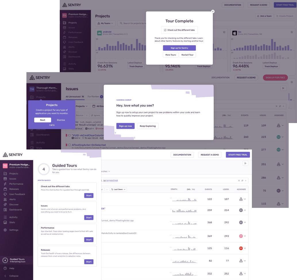
To overcome these challenges, I spearheaded the creation of an interactive sandbox environment that allowed users to experience Sentry firsthand without any commitment. Collaborating with the Workflow, Data, Sales, and Marketing teams, we ensured the sandbox was both accurate and insightful.
Guided Tooltips: Implemented tooltips to navigate users through key features, helping them understand the platform's capabilities without feeling overwhelmed.
Explicit Prompts: Added clear calls-to-action after each section to encourage sign-ups while allowing users to continue exploring if they weren't ready.
Timed Nudges: Set up prompts that appear after a certain time to gently guide users toward creating an account.
Efficient Onboarding: Designed a concise start tour respecting users' time, focusing on the most impactful features.
By addressing the motivation (anticipation and avoiding fear), enhancing ability (minimizing time investment), and providing the right prompts, we created a seamless user journey.

Results That Helped Sentry and Its Users
The introduction of the sandbox led to significant improvements:
Conversion Rate Surge: User conversions increased from 2% to 5.6%, exceeding our initial goal.
Broadened User Base: Saw a 180% increase in trial sign-ups among junior developers and small teams.
Reduced Onboarding Time: Cut down the onboarding process by 30%, allowing users to quickly access valuable features.
Enhanced User Trust: By providing a hands-on experience, we built trust and showcased transparency, critical factors in user adoption.
Impact on Company Revenue
By lowering the entry barriers and educating users effectively, we tapped into a previously underserved market segment. The influx of new users from smaller teams and individual developers opened up additional revenue streams, contributing positively to Sentry's bottom line.
Takeaways That Made Me a Better Designer
Respect Users' Time: Developers appreciate efficiency. Streamlining the onboarding process led to higher engagement.
Education Over Promotion: Allowing users to explore the product answered questions they hadn't even thought to ask.
Data-Driven Decisions: Leveraging user data and feedback was crucial in tailoring a solution that met real needs.
Cross-Team Collaboration: Working with multiple departments ensured a well-rounded and effective product.
Conclusion
By creating an interactive and educational sandbox, we not only surpassed our conversion goals but also enhanced the overall user experience. This project underscored the importance of user-centric design and the impact of collaborative efforts on achieving business objectives.


